

Why Art Deco Jewelry Used Colored Gemstones So Differently
Art Nouveau jewelry often allows forms to flow into one another. Lines curve. Enamel glows. Stones participate in organic compositions.
Then Art Deco arrives—and suddenly the visual language changes.
Lines become sharper.
Geometry becomes stronger.
Contrast becomes deliberate.
And colored gemstones begin doing something extremely powerful. They create structure.
Color Becomes Architectural
Art Deco jewelry of the 1920s frequently combines diamonds, platinum, and strongly colored gemstones.
Sapphire blue.
Emerald green.
Ruby red.
Black onyx.
The color does not necessarily appear as a soft transition. It often appears as an interruption.
A line.
A block.
A border.
A repeated geometric element.
A center of visual gravity.
The Metropolitan Museum of Art characterizes Art Deco jewelry by its dense concentrations of gemstones, geometric patterns, and frequent use of platinum, with colored gems used alongside diamonds to create strong accents.
Color becomes part of the architecture.
Platinum Changed What Jewelers Could Draw in Metal
Platinum’s strength allowed jewelers to build comparatively delicate structures capable of holding numerous stones. Visually, platinum also recedes beside diamonds. That created an almost continuous field of white brilliance.
Now introduce a sapphire. Or an emerald. Or a ruby.
The color becomes extremely visible because the surrounding structure is comparatively neutral. That relationship is important. The gemstone’s impact does not come only from its own color. It comes from the contrast around it.
This is something contemporary designers can use just as effectively.
Colored Stones Were Often Used as Shapes
Look at an Art Deco piece and notice how often the colored gemstone’s outline matters.
Squares.
Rectangles.
Cabochons.
Calibrated stones.
Strong repeated geometric units.
The stone is not merely “a sapphire.” It is a blue rectangle. Or a row of blue squares. Or a green center surrounded by concentric geometry.
The Met’s collection includes an emerald bracelet attributed to Dreicer & Co. whose emeralds punctuate an otherwise diamond-and-platinum geometric composition.
That gives designers an important lesson:
A gemstone has both material identity and graphic identity. It is mineral. But it is also shape, color, proportion, and direction.
Contrast Can Make a Small Stone More Important
Designers sometimes assume a visually important gemstone needs to be large. Art Deco jewelry repeatedly proves otherwise. A small saturated sapphire placed inside a field of diamonds can command enormous attention.
Why?
Contrast. A row of small rubies may define an entire edge. A narrow line of black onyx can reorganize the visual structure of a brooch. The amount of material is not necessarily what determines importance. Placement does.
The Setting Becomes Part of the Pattern
This is another reason studying historical jewelry is useful for metalsmiths. We often think of the setting as the thing that holds the gemstone.
In Art Deco work, setting style and overall pattern can be difficult to separate. Metal divisions create geometry. Gemstone outlines reinforce geometry. Rows of stones create borders. Repeated settings create rhythm.
The technical system becomes the visual system. That is sophisticated design. The mechanism is not hidden from the composition. It helps create it.
Colored Gemstones Also Connected Cultures and Eras
Art Deco designers drew inspiration internationally.
The Met notes influence from both the Near and Far East, while Cartier famously incorporated older Mughal gemstones into modern twentieth-century settings. One Cartier brooch in the Met combines a carved Mughal emerald with sapphires in a platinum mounting from around 1920.
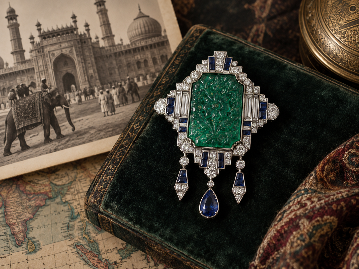
That piece is fascinating because the gemstone carries one history while the setting belongs to another. The stone is not merely color. It brings an existing object, carving tradition, geography, and earlier use into a new design.
Think About the Stone as a Design Element Before a Gemological Object
When you select a colored gemstone, of course you need to understand its physical properties.
Durability matters.
Cleavage matters.
Treatments matter.
Setting safety matters.
But after those questions comes design.
What is this stone doing visually?
Is it creating contrast?
Rhythm?
A directional line?
A focal point?
A transition?
Is the color warm or cool relative to the metal?
Will a halo strengthen it or overwhelm it?
Does the cut reinforce the composition?
Those are the questions that transform a gemstone from something we own into something we design with.
The Lesson Art Deco Leaves Us
Colored gemstones do not need to be treated as isolated centerpieces. They can become punctuation.
Geometry.
Rhythm.
Structure.
Contrast.
That is one of the reasons Art Deco jewelry still feels so visually powerful. The makers were not simply showing us beautiful gemstones. They were controlling exactly where color entered the composition.
And once you begin thinking about colored stones that way, selecting a gemstone becomes only the beginning. The next question is:
What job will this color perform in the design?