

A small gold detail can dominate a dark surface without occupying much space. Its importance comes partly from what surrounds it: the quieter ground, the distance to the next bright area, and the way the surface catches light.
Shakudo gives us a rich historical context for examining those relationships. It is a Japanese copper-and-gold alloy associated with a dark patinated surface. The Metropolitan Museum of Art describes examples patinated to a blue-black color and used for sword mountings and other small decorative objects. The material’s identity includes both the alloy and the surface developed on it.
A material with a history
Shakudo should not become a convenient name for any blackened piece of copper. Its particular alloy and patination traditions matter. Research into historical and experimental examples has examined how alloy composition influences the resulting patina; a familiar-looking color does not make two materials equivalent.
The history also extends beyond a single kind of object. L’ÉCOLE’s exhibition Shakudō From Samurai Ornaments to Jewelry presented Japanese decorative elements incorporated into European jewelry mounts. Its examples included bracelets, brooches, and necklaces with scenes and details articulated in contrasting metals.
That movement between object types raises a design question: how does the same small composition change when it leaves one setting and becomes something worn in another way?
Notice where brightness is withheld
When studying a documented example, begin by identifying the brightest area. Then look at the space around it. Does the contrast establish a focal point, explain a figure, separate overlapping forms, or give the eye a path through the scene?
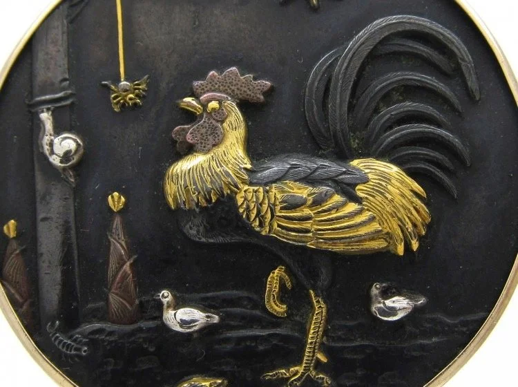
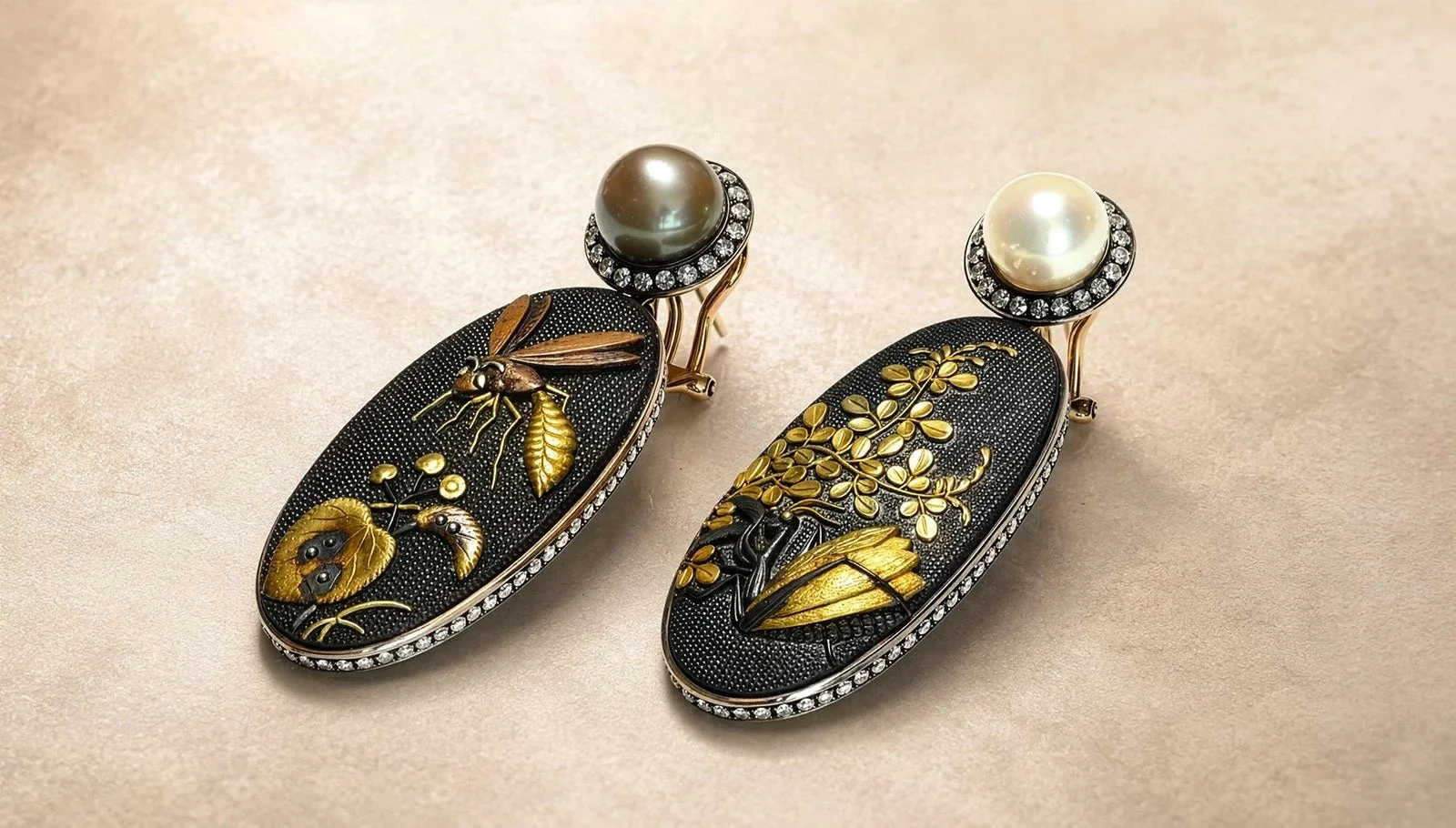
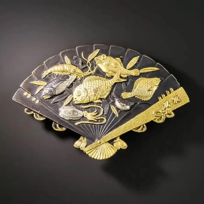
Try covering one bright detail in a photograph with a small paper tab. Observe what changes. Sometimes the composition becomes quieter. Sometimes its organization becomes less clear. This simple exercise helps separate an essential accent from an area that merely adds visual activity.
You can use that question in contemporary work without copying the object’s imagery. A satin silver plane beside a polished edge, an enamel field around a metal line, or a dark textile behind a bright connection can create their own relationships of light and attention.
Design the surface early
If contrast is central to a piece, include it in the first studies. Make a drawing with dark, middle, and light values before deciding exactly which materials will produce them. Check the drawing at the scale of the intended jewelry.
Then make appropriate material samples. A dark ground that looks convincing in a photograph may behave differently under changing light. A bright accent may disappear when it reflects dark clothing. Wear and handling will also affect some surface treatments more than others.
This is a design exercise, not a recipe for reproducing traditional Japanese patination. Learning the historical process deserves suitable instruction and material-specific testing. The lesson you can take immediately is one of proportion: decide how much brightness the composition needs, where it belongs, and what the surrounding surface must do to support it.
Call to action
Revisit Making Design Decisions in My Bench and use the finish and visual-hierarchy prompts to plan a three-value study.